Critical Manufacturing and Engineering Services
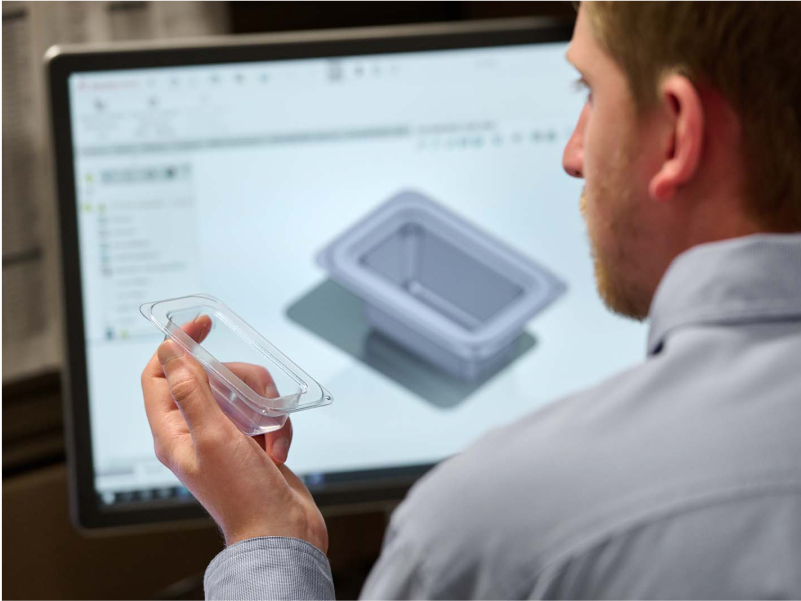
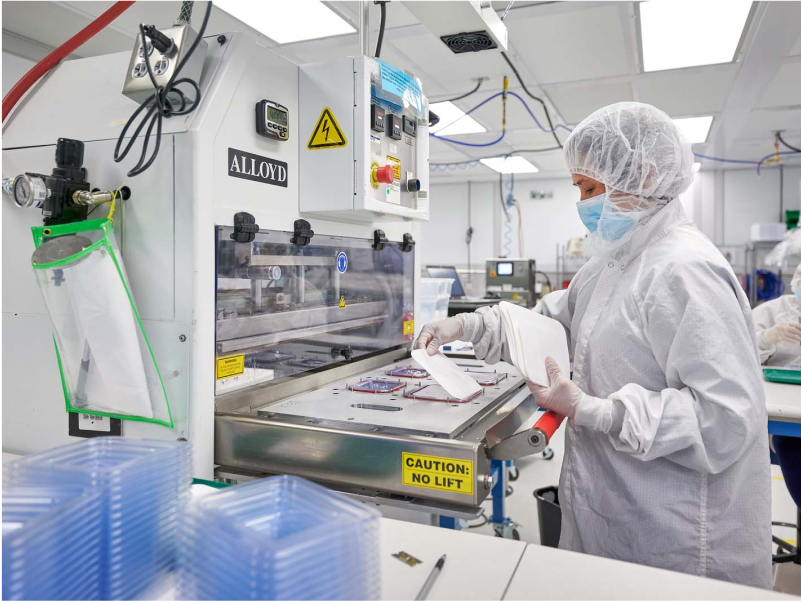
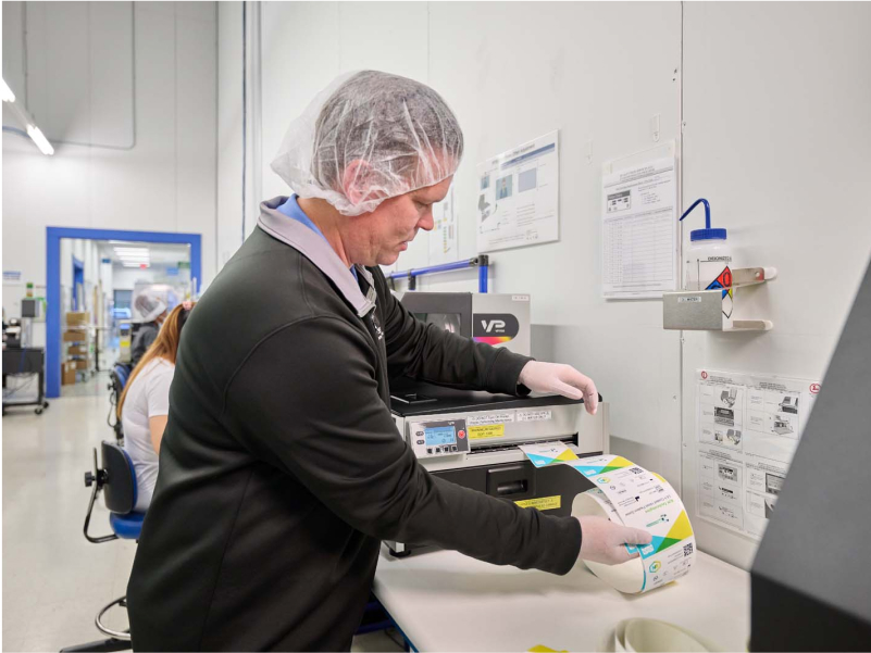
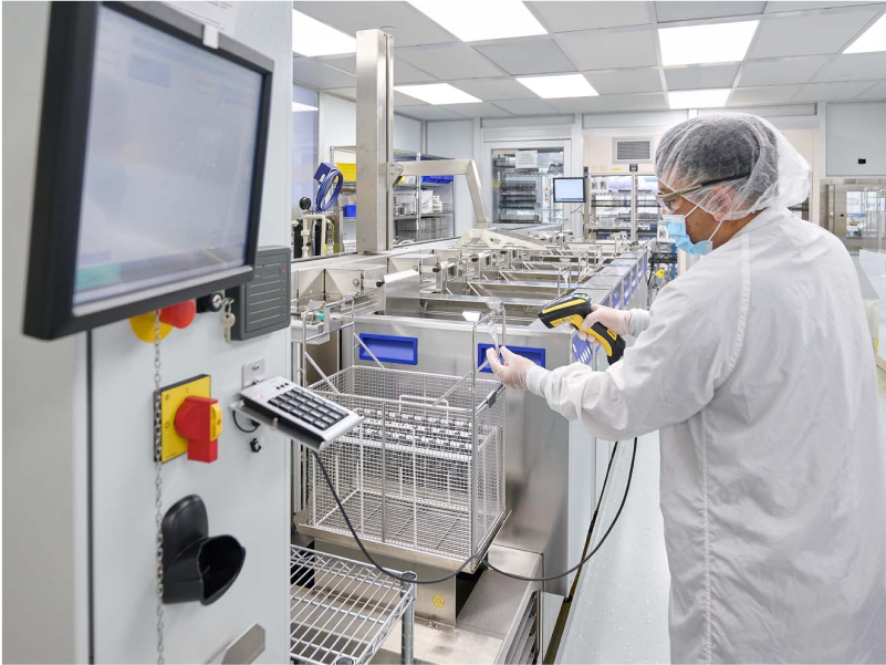
Our services make it easier to get your products to patients. From complex assembly and packaging to contract sterilization, we ensure that your patients receive the full impact of your life-saving products.
Access Experts
Our technical experts enable you to navigate the complexities of medical device development and manufacturing.
Save Time
Our collaborative and responsive staff paired with our prevalidated services, increase your speed to market.
Simplified Supply Chain
We manage multiple suppliers on your behalf and reduce the demand on your resources.
Reduce Risk
Mitigate your risk with our uncompromised commitment to patient safety and outstanding quality track record.
Launch & Scale
We pair the agility of a small company with the large company resources of Cretex Medical to meet your production demands.
Get Started With The Resources You Need
Tell Us About Your Project
Tell us how we can help you bring your finished device to market.
Connect With An Expert
After reviewing your information, we will connect you with the team member best able to help with your project.
Receive A Proposal
Our team will prepare a proposal specific to your project requirements.
